
A drop with five colors can look like five brands if each photo is lit by a different mood. A color story is the decision to show one family on purpose: the clay, the sand, the cream, and nothing that screams for attention in between. The buyer should be able to screenshot the row and understand that these objects belong together and that they can buy them. The story is not a filter dumped on top of random pictures. It is what you shoot, what you leave out, and the order on the grid.
You are merchandising a shelf that happens to be a profile. Neurollamas is an AI marketing studio for product shops and creators. The palette and the references for it sit on the brand profile at neurollamas.com so the next batch does not “freshen” the drop with a color you do not sell.
Name the family before the shoot
Write three lines at the top of the shot list:
- The colors you are actually shipping, in the names on the page. “Sand, clay, cream.” Not “earthy vibes.”
- The colors you are banning from the set. A cobalt napkin, a red logo sticker, a green plant that becomes the subject.
- The light. One window, one time of day. If half the frames are noon and half are tungsten, you do not have a story. You have two shoots.
Put a swatch or the actual glaze chip on the table and photograph it for yourself. You will need it when a generated frame drifts. The one-session method is how you get the family in one afternoon instead of “fixing it in post” for a week.
If a color is not ready, do not include a stand-in. A promised glaze that is still in the kiln is not a tile. The restock language can say when it joins. A fake tile of a color you cannot ship is a preorder you did not mean to open.
Six posts, one drop
You do not need a new idea per color. You need a sequence:
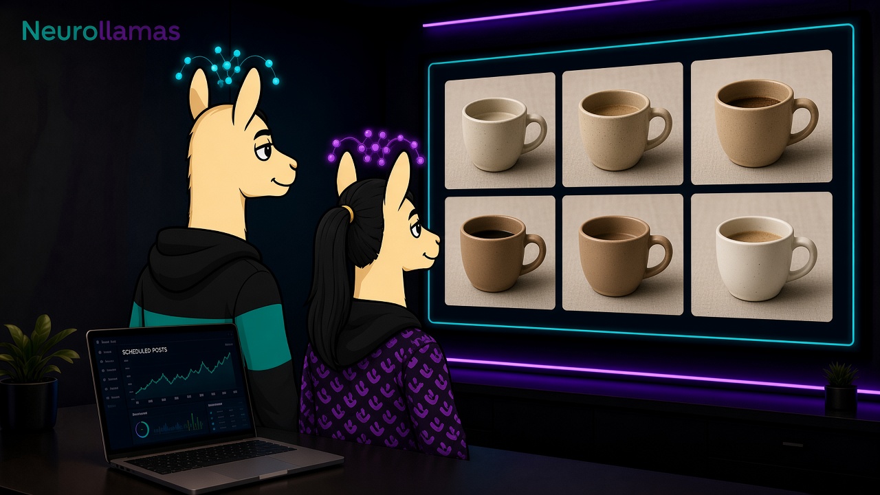
- The row. All the colors together, labels or shapes readable, caption lists the names and which ones are in stock.
- The hero. The one color you most want to sell, large, with the fact that makes it different from the others. Not “our favorite.” A fact: thicker wall, undyed, the last of the sand.
- The comparison. Two colors, side by side, one sentence on how they differ in daylight. This is the post that cuts “which one is lighter” DMs.
- The scale. One object in a hand or next to a common object, same background family. Size posts earn their keep here, as in sizing posts.
- The detail. The rim, the stitch, the glaze pool. Caption says what the detail is, not “obsessed with this texture.”
- The use. The object doing the job, still inside the color family. A cup with coffee is fine. A cup in a neon cafe is a different campaign.
That is the drop. Stories can repeat crops from these six. A seventh feed post that breaks the palette to “stop the scroll” also stops the shop from looking like itself. Hold it for another week.
Order the grid so the family is visible
Instagram shows three across. Place the group shot or the hero so it anchors a row, then flank it with crops from the same light. The grid guide is the check: scroll the newest nine and ask whether a stranger sees one drop or a yard sale.
Do not alternate with quotes, memes, or a collab in a clashing color until the six have had their week. A neighbor collab can wait until the drop is legible. Preview the order in Instagram UI before you publish the first tile, because fixing a row after two posts are up means deleting or distracting.
Captions should repeat the color names in plain words. Search and memory both use those words. “The sand glaze, not the cream” is more useful than a poem about dunes. Pair that with the keyword habit in keyword captions. The color name is the keyword.
If you generate frames, lock the chips

A model will invent a prettier green if you say “natural.” Do not say natural. Attach the real photo and say the banned colors out loud in the prompt: no blue, no red logo, linen background, daylight from the left, same cup as the reference. Generate from the image studio only after the real session exists, so you have something true to compare.
Reject a frame when:
- The glaze is more saturated than the chip in your hand.
- The background product is a color you do not sell.
- The shape drifted. A generated “similar cup” is a different SKU.
- Text appeared on the object. Take it out and use the caption.
The on-brand photo rules are the longer checklist. Color is the first place generated images lie, because a lie in color still looks attractive.
Write captions that help someone choose
People do not need you to feel something about sand. They need to pick.
“Three glazes this drop: sand, clay, cream. This photo is all three in the same window light. Sand is the lightest. Clay is the grey-brown. Cream is the one that looks white until it sits next to paper. All three are in stock, $38, same shape. If you want a pair, say which two and we will confirm before you pay.”
A comparison caption:
“Sand on the left, clay on the right. Same cup, same hour. If your table is pale wood, sand disappears a little. Clay holds a line. We shot this so you would not have to guess from a single photo.”
Avoid “link in bio for the vibe.” Name the page. If the page sorts colors badly, fix the page before the post, using the match in page and grid. A beautiful row that lands on a dropdown labeled “color: default” wastes the shoot.
When the story is over
A color story is for the life of that drop, not a permanent filter on the account. When the next object is black hardware or a printed label with its own inks, start a new card. Forcing the sand family onto a product that is not in it makes both look fake.
On the brand profile, archive the palette with the SKUs it covered: light, background, banned colors, the six assets that were approved. Next time you reorder the sand glaze, you reuse the card instead of reshooting your personality. If a color sells out mid-story, say so on the group tile’s caption or in a Story the same day. Leave the photo up. Add the truth. A palette with a hole is still a shop. A palette that pretends the hole is not there is a complaint.
Stories can sample the family without adding a seventh idea
Use Stories for the questions the six captions did not have room to finish. A finger on the rim to show thickness. The three cups in the order you named them, left to right, so “sand, clay, cream” matches the swipe. A boomerang is unnecessary. A still crop is enough and it will not invent motion blur that changes the glaze. If someone asks for a color you banned from the set, answer with the name of what you do ship. Do not generate the missing color “just for the Story.” A Story is still a promise if the sticker links to a product.
If a swipe gets the order wrong, reshoot the three cups rather than explaining the mistake in text. People will not read a correction sticker as carefully as they read the picture. Save the chip photo and the banned-color line in the same folder as the six approved frames. When you brief the next batch, that folder is the brief. Write “sand, clay, cream, daylight from the left, no blue, no red mark” at the top of the card on the brand profile. A later session that starts from taste words instead of those chips will give you a prettier row and a wrong catalog. One drop, one family, six jobs. That is enough color for a week, and it is specific enough that a new visitor can buy without decoding your taste.